Building a Button: A Case Study

Disclaimer: While inspired by my work on other design systems, this sample component does not come from any of them. I built it for the purpose of demonstrating my design approach.
Introduction
Designing components for a design system requires balancing multiple considerations. These include the technology stack, engineering implementation, usability for designers in Figma, consistency within the overall library, and accessibility compliance. By carefully structuring component libraries and leveraging best practices, components can be adaptable, scalable, and intuitive for both designers and developers.
Establishing the Foundation
Assuming that the atomic components have already been designed, I start by setting up a Figma library in which they are included as variables. This covers attributes such as:
Color
Corner radius
Spacing
Stroke width
Since typography and elevation don’t yet support variables, I use Figma styles instead. This setup ensures that components can easily adapt across different brands, making it possible for single components to be used across multiple product lines with a single click. Additionally, I include a low-fidelity (lo-fi) variable mode to enable quick and easy iteration on simple designs.
Define Essential Elements
The first step is determining the core elements of a button. These include:
A label
An optional icon on either side
If I were building a more complex component- say a combobox- I’d include a header, input field, dropdown menu, and list items. It’s important to ensure that you have everything I’ll need in your initial version of the component because those elements will be shown / hidden with booleans later.
To keep libraries manageable, I often create multiple libraries referencing each other. Typically, this includes a core component library and a separate library for icons and illustrations. For this example, I am using icons from Tabler, a free icon library which I've compiled in a separate library. In the future, I aim to develop a custom icon library- it's been a goal of mine for years.
Structuring the Component

Next, I’ll put them in a frame with auto layout and apply my variables for padding and spacing. And then I’ll fill it with color, again using variables.
Since I want this to meet WCAG guidelines I’ll put it in a second frame- this one invisible- and make sure it’s 44px tall to meet minimum tap target thresholds.
Now that the outer frame is made, I’ll make a border, set to a variable that’s 0px in hi-fi, and 1px in lo-fi. This will allow me to see the borders in a lo-fi variant of the design system, and by using variables it’s just one click to switch between them.
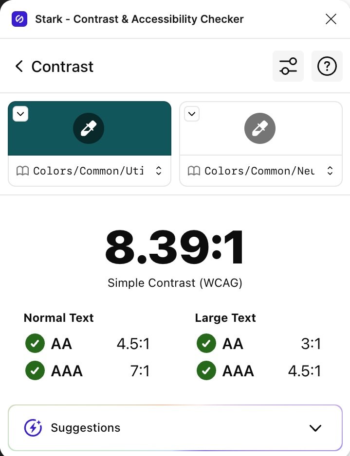
Finally, ensuring color contrast is key, so I’ll use a Figma plugin to double check my work. I really like one called Stark which not only lets you check contrast, but also simulates different vision modes.
Adding Properties and Variants
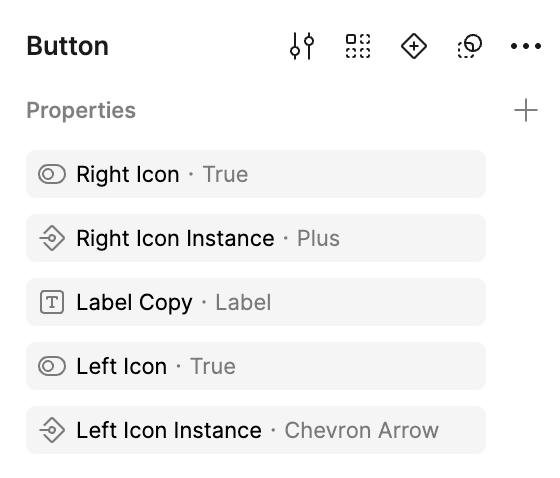
Next step is to go ahead and turn this into an actual component. I’ll take each icon and give it a boolean property, and then an instance swap property as well. That way designers can easily pick which side they want an icon to be on and swap it out. I’ll also make sure the icons on each side are common instances in line with established patterns- in this case a plus and a downward chevron. I’ll also expose nested instances so that the size of the icons can be swapped by a designer using this component.
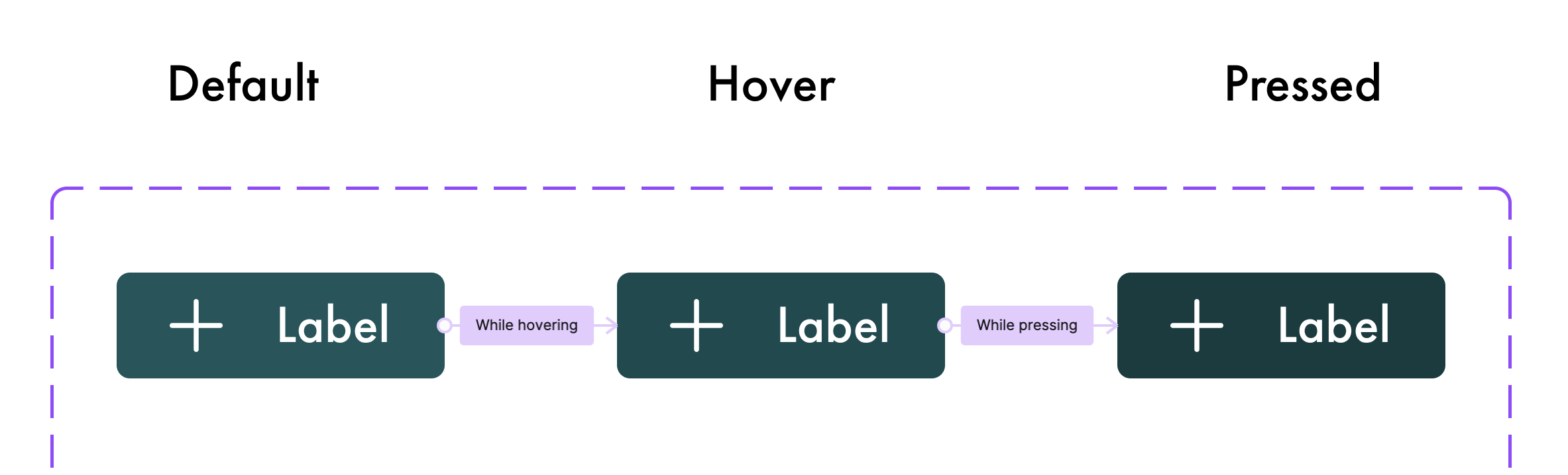
Now it’s time to add hover and, pressed variants. I’ll go ahead and hide the right icon, but the left can stay visible. I’ll also wire up the prototype, so that hover and pressed act properly.
From here, I’ll add some more variants- stroked and text only. I’ll do this by selecting all of the existing variants and duplicating them- with alt + click and drag. This will ensure they keep all the prototype settings I previously applied.

Now, I’ll duplicate this entire set 3 more times- we’re going to need a secondary color, a danger color, and finally a disabled color. We’re almost done now, the final step is to include best practices for the component which I will build into the component description.

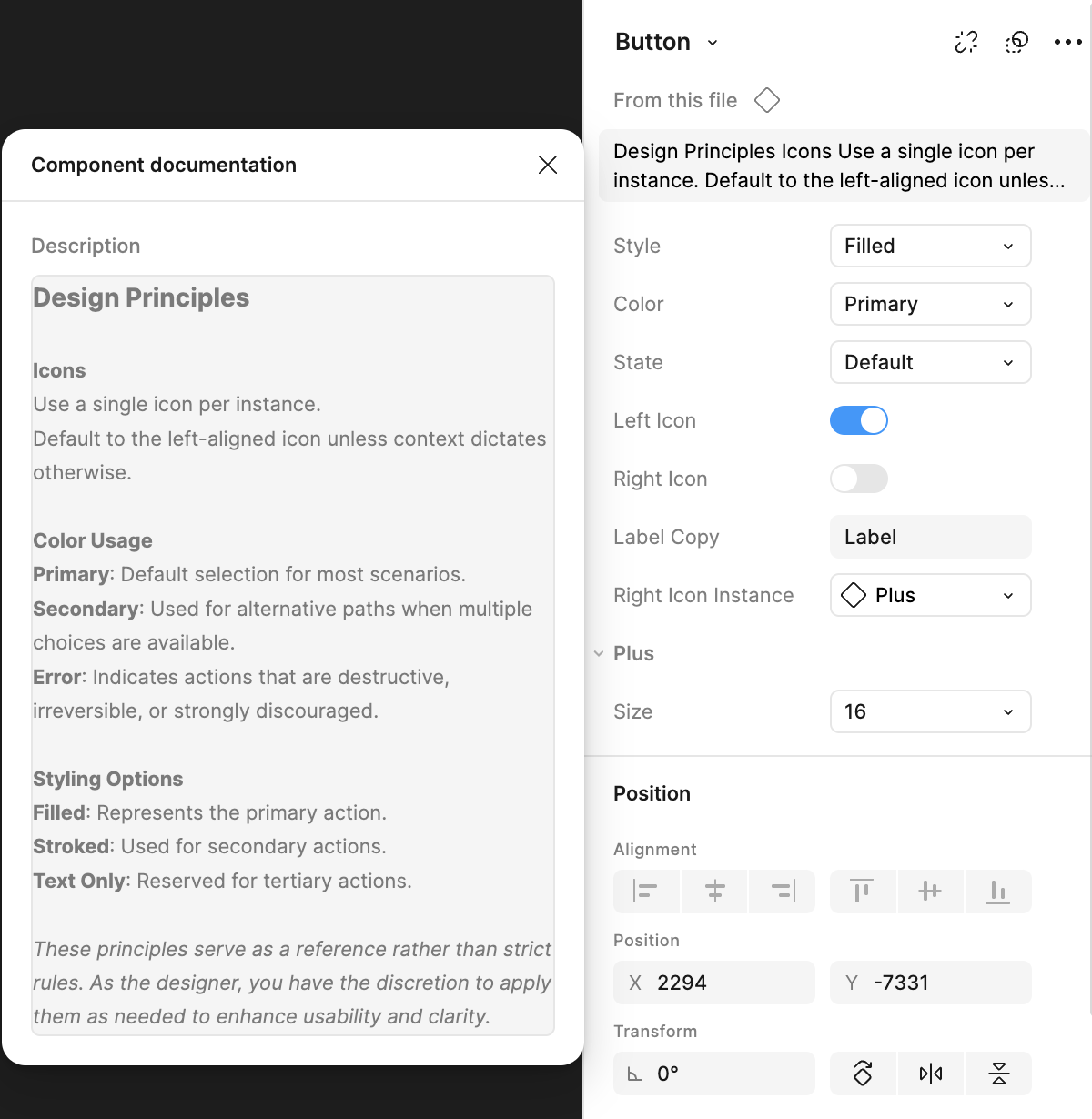
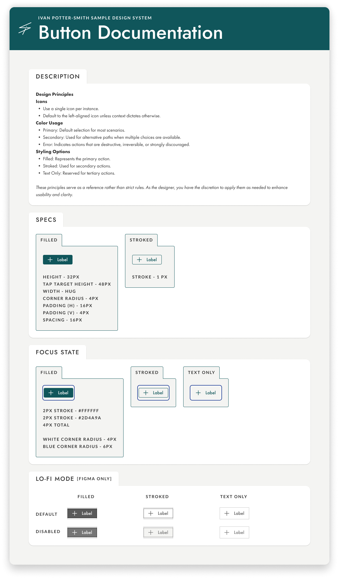
Documentation & Final Steps
Next up it’s time to document the specs. Thanks to Figma dev mode, a lot of this is easy for devs to find already, and the written specs are more of a reference for changes occurring between different variants of components.
Now that everything is documented and the component is ready to go, I’ll often bring in other designers to give a once over, test the component, and see if they can spot any accessibility errors. After that I’ll consult a developer to ensure the component meets their needs, and discuss any accessibility criteria related to Aria. If a component has multiple elements to tab through, I’ll expand the focus states documentation panel to include the tab order as well.
It’s important to be as thorough as possible when considering and documenting accessibility concerns.
And that’s how I build a component! Well, a general overview. The button was simple- tables, filters, multi-selects? Don’t get me started…. (or do).